Private Cellular Dashboards
The Kyndryl private cellular service comprises 15 dashboards that provide performance and failure management data from private cell APIs such as Nokia Digital Automation Cloud, helping users understand network health and issues.
Technical prerequisites
- Nokia DAC is deployed and accessible
- Data Streaming service and SynApps setup with a topic
Private cellular dashboard filtering
The dashboard comprises the following elements:
- Global Filter: Select from a dropdown list of filtering options accompanied by operators and parameters.
- Range Filter:Select from a range of time spans bounded by Today and Last Year (the last 12 months).
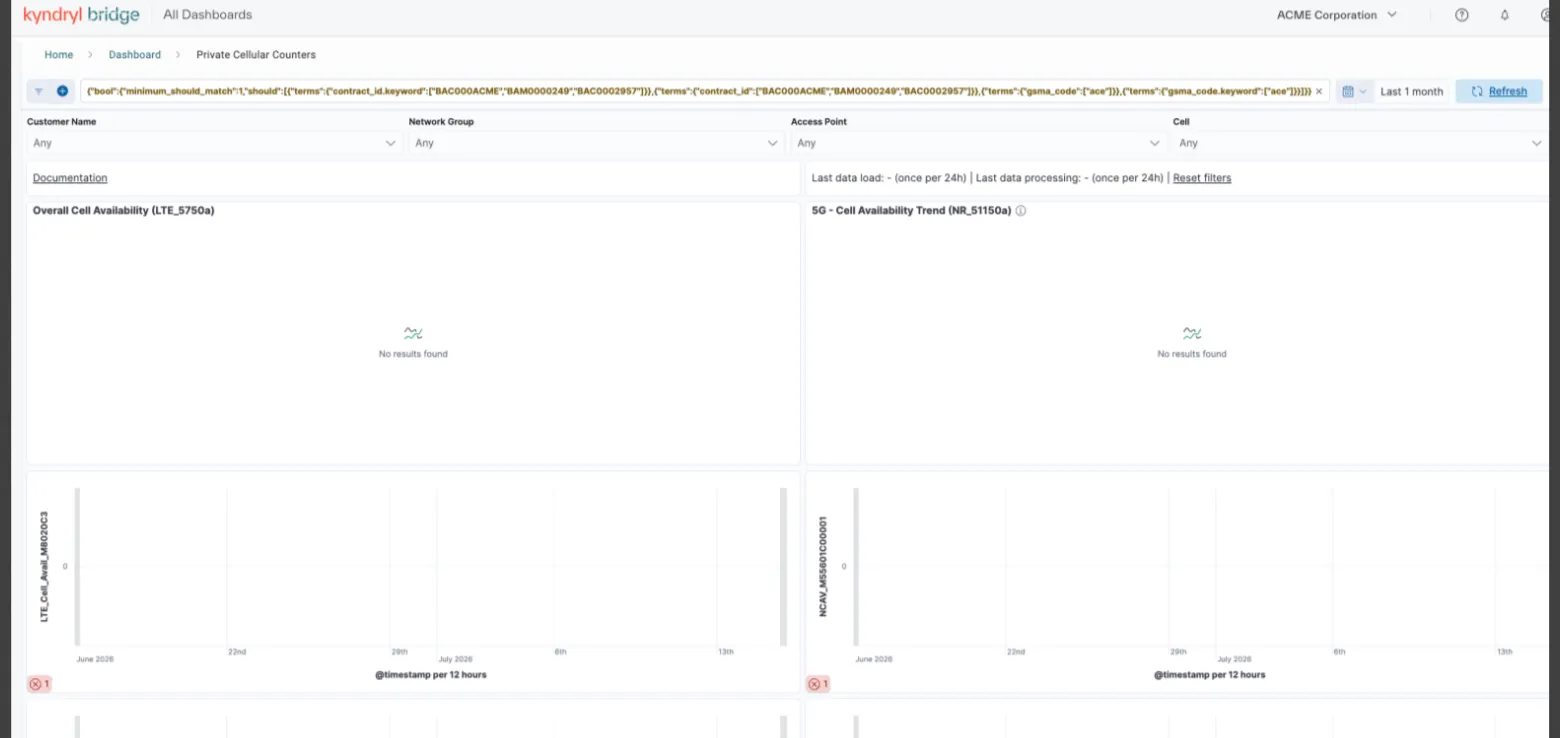
The global filter enables you to narrow the observable data set on the Network Performance monitoring page, limiting it to only data to your circumstance. The filter is located directly below header indicating the selected tab for the dashboard segment, for example Inventory Overview (Monitoring - Inventory).The filter comprises two buttons:
- Filter control (grounding icon):
- Add filter: Add a filter element.
- Apply to all:Apply the filter to the data set.
- Clear all: Clear all applied filters, restoring the defalut data set of all data.
- Add filter (plus icon): Add a filter element.
Refer to the following image for more details
Filter time range
Use the following procedure to filter the time range for the current data set by time range and other parameters:
- Select a time range. The default time range is Last 7 days. If no changes have occurred in the default or selected date range, data visualizations will not populate. Examples of such changes include new nodes, new interfaces, and events. To change the current date range, use the following procedure:
- Click the Calendar icon. The service displays the quick select dialog, presenting a range field that you can manually set and a list of preselected options.
- From the units field dropdown menu, which defaults to 7 Days ago, select the unit, Days, Weeks, Months, Years. Set the quantity by entering, incrementing, or decrementing the unit quantity. For example, select Months, then decrement 7 to 6 to change the value from 7 days ago to Last 6 months.
- Click Update. The service updates the data for the selected date range.
The default time range, 7 Days ago, applies initially to all six dashboards; adjust each as needed.
- Click the Plus icon. The service presents the filter editor.
- Select a field from the Select a field dropdown menu. You can select from any supported field in the network device or operating system record.
- Select an operator from Select operator field:
- is: Equal to
- is not: Not equal to
- is one of: Some fields might have more than one value. This operator specifies a specific value in such a field.
- is not one of: Some fields might have more than one value. This operator specifies that none of the values exist in such a field.
- exists: Any device or operating system description that contains the specified field.
- does not exist: Any device or operating system description that does not contain the specified field.
- Select a value from the Select a value field.
Optional: Add a an additional parameter by selecting boolean OR or Boolean AND:
- Repeat steps 2 through 4.
Optional: Repeat step 5.
- Click Cancel to cancel the filter addition or Add filter to add the filter you constructed.
You may add additional filters as required to adequately narrow your data set. You can also edit a constructed filter as a Domain Specific Language query by clicking the Edit as Query DSL link located at the far right of the Add filter editor.
In addition to data visualizations, the page provides a quick filter to enable the narrowing of data without complex queries. Data is tagged that represents useful parameters such as Customer Name and Network Group. An array of tag filters is located below the global filter, each of which includes a dropdown menu.
Filtering using Tag Filter
Use the following procedure to filter current data using the tag filters:
- Click the dropdown menu from the tag field.
- Select the desired parameter value. the data is immediately updated.
Alarms dashboard
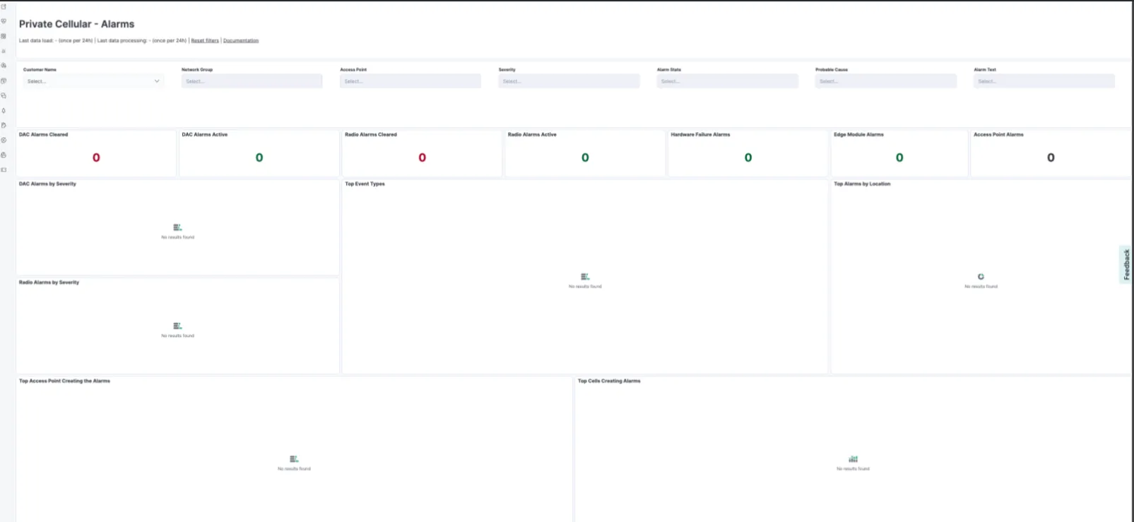
The alarms dashboard is a view of reactive monitoring for events that might require action (active) or that can be cleared when no action is required. In this dashboard, you can get an overview of alarms by severity and location, the top events triggering the most alarms, and the types of devices triggering them. In this view, you can also see the days and times when the alarms are typically triggered so that preventive actions can be planned.
Cell performance dashboard
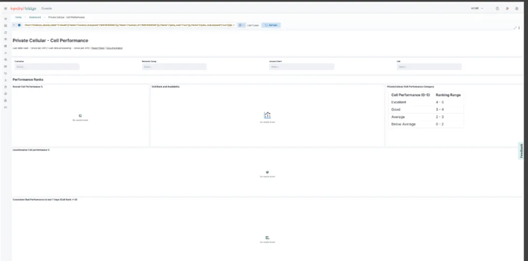
The Cell Performance dashboard provides an overview of key performance metrics for cell devices, including ranks and availability ratios. It identifies poor-performing cells by location and features a daily performance heat map. Key performance indicators (KPIs) include ranking, availability, retainability, mobility, accessibility, and integrity/quality. Performance is categorized as Below Average (0–2), Average (2–3), Good (3–4), or Excellent (4–5). This KPI assesses service availability in cells for end users, focusing on:
- RRC connection establishment.
- Initial E-RAB setup for network access.
- Data radio bearer setup via RRC connection reconfiguration.
- E-RAB setup between MME and UE.
It also tracks the following:
- - Abnormally released E-RABs ratio.
- - Uplink/downlink retransmission ratios for RLC PDUs.
- - Lost PDCP SDUs ratio. - Handover success ratios (intra-eNB and inter-eNB).
- - RA preamble responses ratio to total RA preambles.
Executive view dashboard
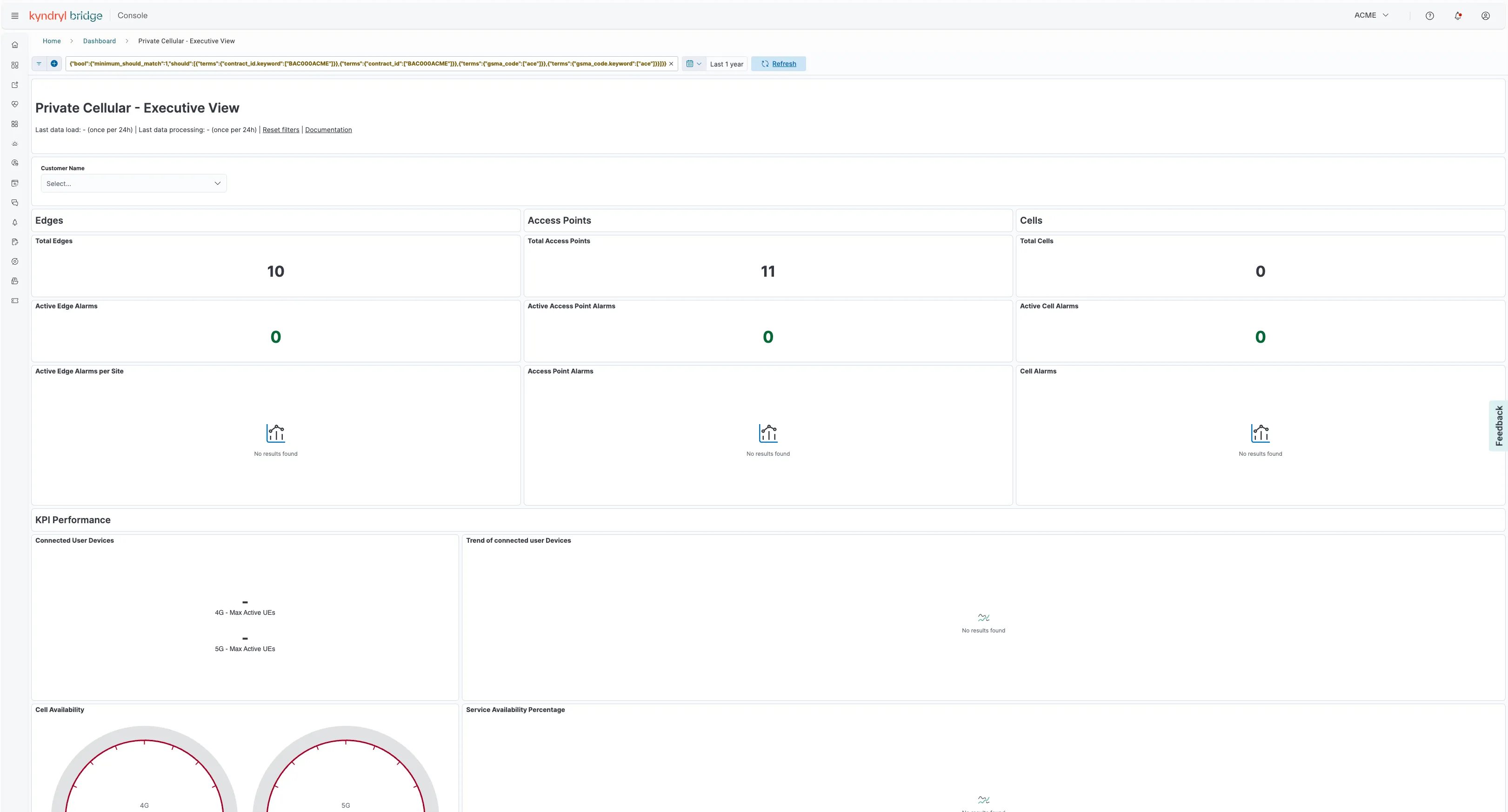
The Executive View Dashboard offers a comprehensive overview of the key devices in the Private Cell network, including Edges, Access Points, and Cells. It displays existing alarms categorized by device type and Location, along with essential indicators of connectivity, availability, and throughput for both uplink and downlink. Additionally, the dashboard highlights trends in these metrics and provides a summary of performance rankings and trends by Location.
Cell availability KPIs dashboard
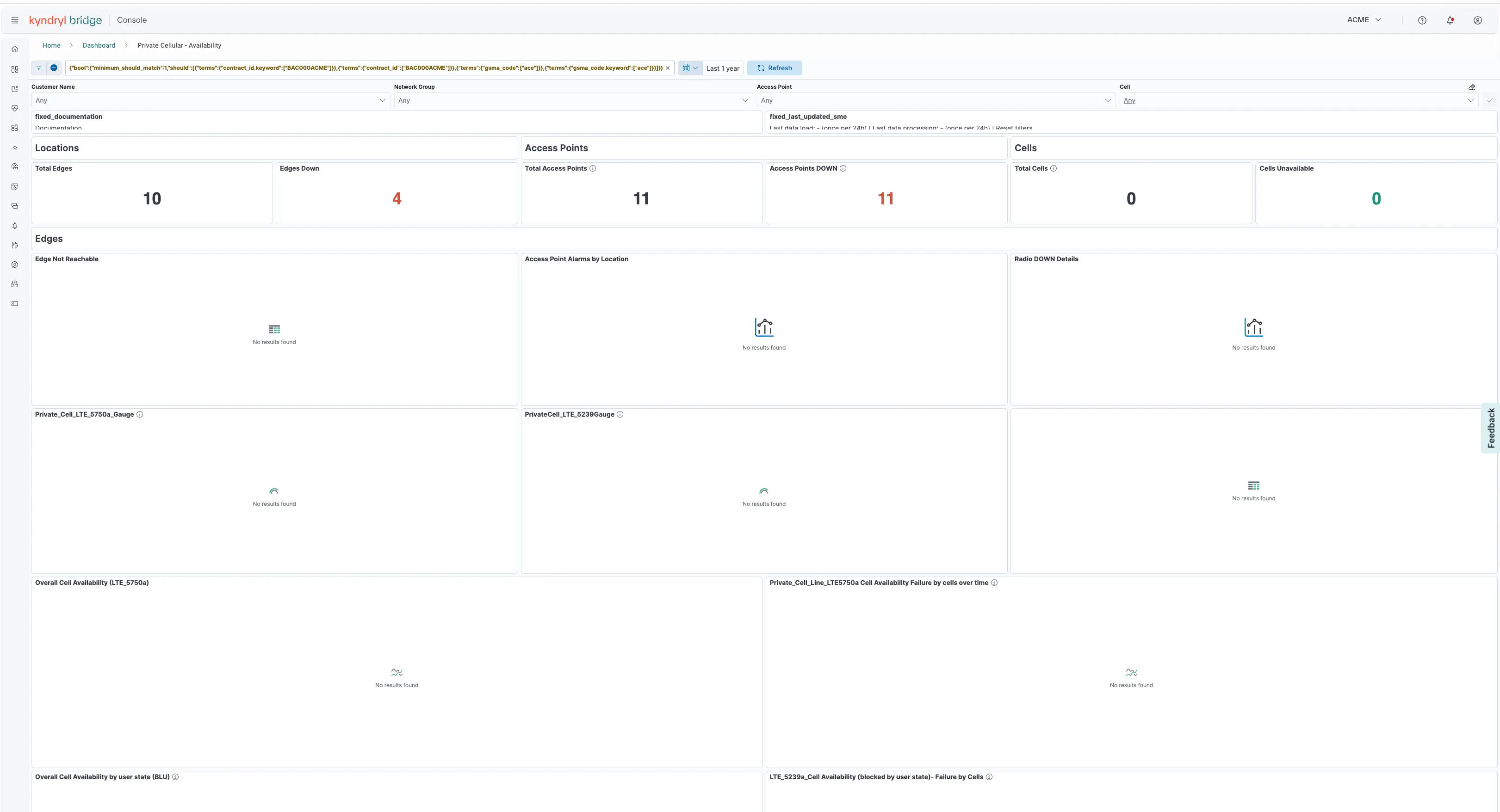
The Cell Availability KPIs dashboard focuses on indicators related to cell availability. In addition to overall availability, it provides insights into availability by user state, time-series line charts for key availability metrics, a view of down devices over time, and a summary table for reporting.
EDGE performance dashboard
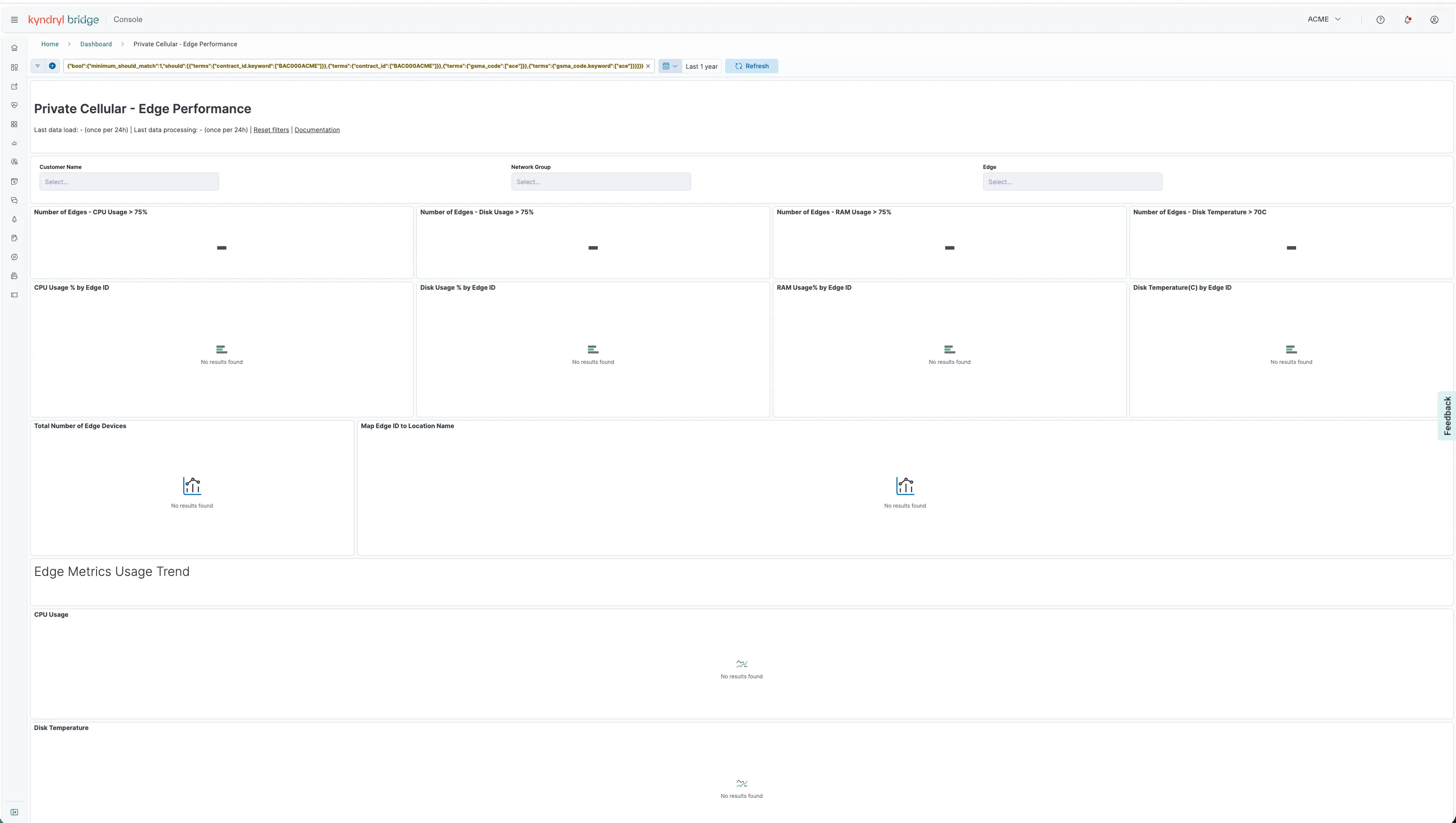
The EDGE Performance dashboard provides a comprehensive overview of Edges, including their locations, total device count, and key metrics such as CPU, disk, and RAM usage, as well as disk temperatures. You can view the top utilizations and analyze a time series that displays their behavior over several days. Additionally, you have the option to download a CSV file containing a summary of all the data.
Accessibility insights
Accessibility Insights offers a range of accessibility indicators, including success ratios for RACH Setup, RRC Connection Setup, and E-RAB Setup. It also displays the failure counts for RACH, RRC, and E-RAB attempts, along with information about the associated cells. The tool highlights the leading causes of RRC and E-RAB attempt failures and tracks how these issues develop over time. Additionally, a downloadable table at the bottom of the dashboard provides comprehensive details about all call setup activities.
The Throughput Insights dashboard presents various aspects of the average PDCP (Packet Data Convergence Protocol) uplink and downlink performance over time, categorized by cell. This includes metrics such as the E-Utran Average Active Users with Data in Buffer, as well as the Uplink and Downlink statistics for each cell. Additionally, a downloadable summary table consolidates all the information.
The Cell Load Throughput and Radio Condition KPIs dashboard primarily focuses on bandwidth usage by cell and User. Here are the main key performance indicators (KPIs):
- Uplink signal strength compared to total wideband received power, which indicates the quality of the signal. Either low or high values may suggest that the cell might not be receiving signals from users effectively.
- Average RLC layer throughput per cell for both uplink and downlink.
- Average PDCP layer throughput per cell for both uplink and downlink.
- PDCP Service Data Unit (SDU) volume on the eUu interface per cell for both uplink and downlink.
Mobility KPI dashboard
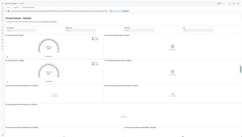
The Mobility KPIs dashboard evaluates the performance of E-Ultran mobility, which is fundamental to ensuring a positive customer experience. Several KPIs are based on intra-frequency, inter-frequency, and inter-Radio Access Technology (RAT). Here are the main KPIs summarized:
- Inter-Frequency HO Success Ratio: Success rate of inter-frequency handovers confirmed by the source eNB.
- Intra-Frequency HO Success Ratio Success rate of intra-frequency handovers confirmed by the source eNB.
- Inter-eNB X2 HO Success Ratio: Overall success rate for inter-eNB handovers.
- Intra-eNB HO Success Ratio: Overall success rate for intra-eNB handovers.
- Intra-sNB HO Attempts: Total number of intra-sNB handover attempts.
- Inter-eNB S1 HO Attempts: Total number of inter-eNB S1 handover attempts.
Call sustainability KPI dashboard
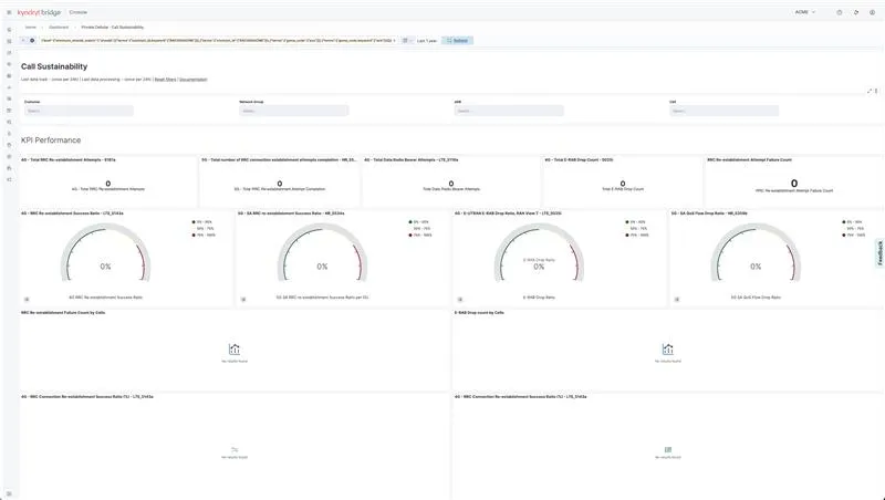
The Call Sustainability KPIs dashboard shows metrics and KPIs for calls that succeed, succeed with reestablishment attempts, reestablishment attempt completions, and failures, including drop counts and reestablishment attempt failures. The dashboard includes the following KPIs:
- RRC Connection Reestablishment Attempts by type (total, "HandoverFailure", "otherFailure", "reconfigFailure").
- Successful RRC Connection Reestablishment procedures.
- Data Radio Bearer Setup Attempts.
- Ratio of abnormally released E-RABs from the RAN perspective.
- Total reestablishment attempts fail.
- Set the success ratio for RRC connection reestablishment to maintain the UE in the LTE RRC_CONNECTED state during failures.
- Average UE-reported Channel Quality Indicator (CQI) value.
Subscriber identity model (SIM) card insights dashboard
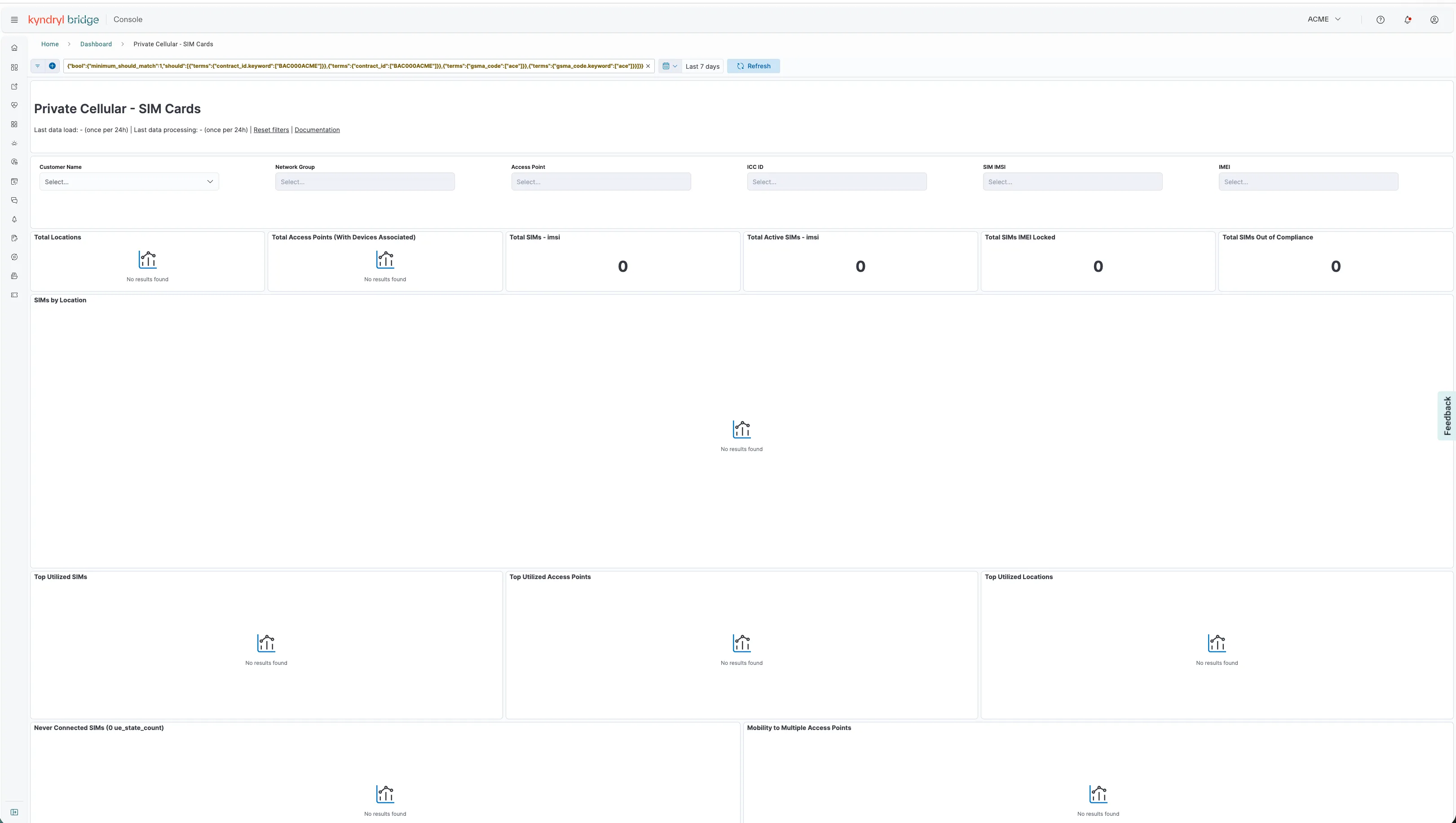
The Subscriber Identity Model (SIM) Card Insights dashboard provides key metrics, including the total number of SIM cards, total active SIM cards, total user equipment (UE) that has been disconnected, total UE that is currently connected, and total UE that has been deregistered. The dashboard also identifies the most utilized SIM cards, access points, and site locations. Additionally, it highlights the SIM cards that have never been connected and tracks their trends over time.
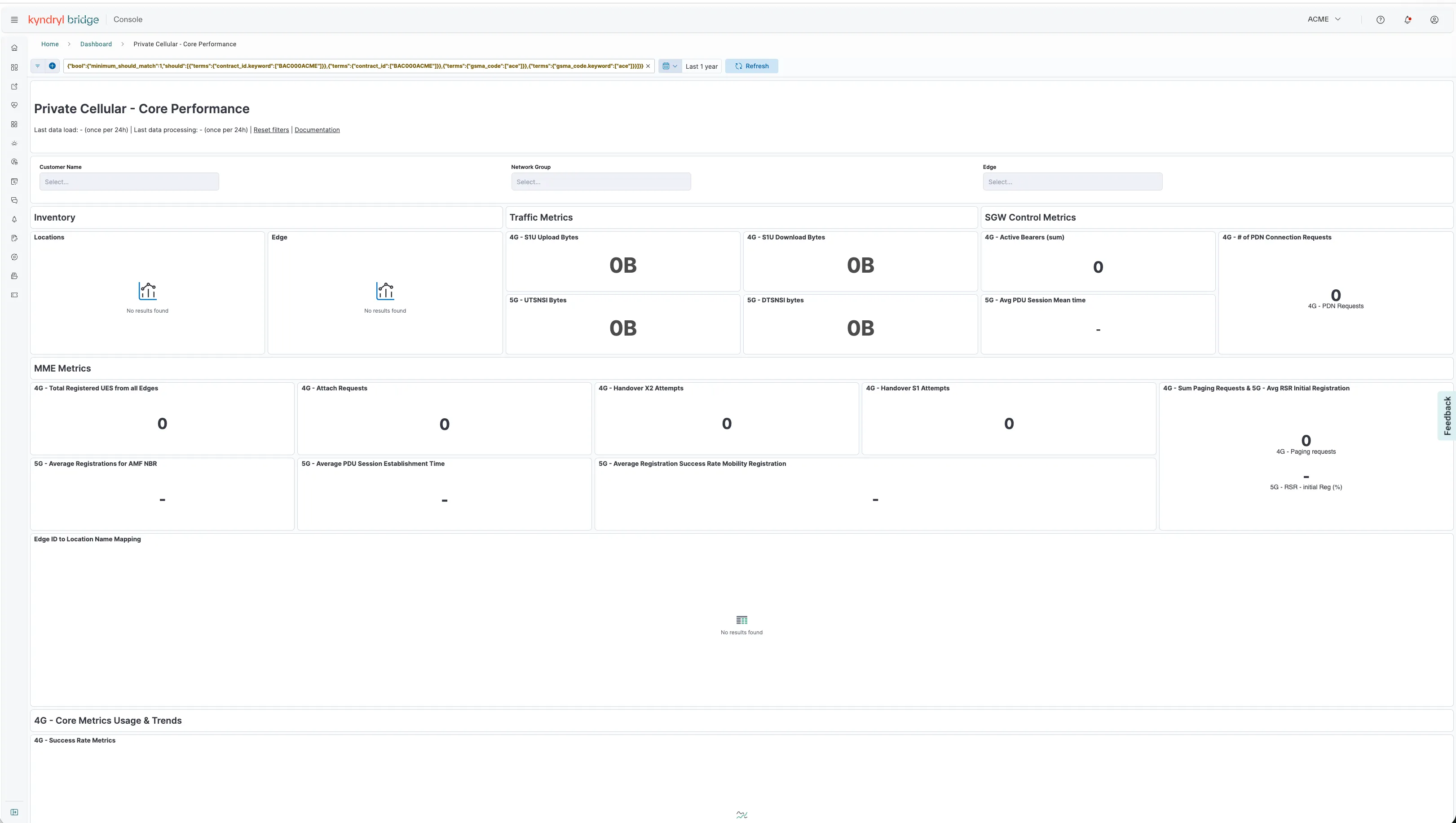
Core metrics dashboard
The Core Metrics Dashboard provides an overview of inventory, traffic, SGW, and MME metrics. It includes details on Edges data attach requests and successes, as well as S1U Uplink and Downlink data in bytes. Additionally, it tracks handover (HO) attempts and successes for S1 and X2, alongside paging requests and successes, PDN connections and successes, and TAU requests and successes. This dashboard provides insights into the status and usage trends of DC Edge devices.