Network Utilization Dashboard
The Network Utilization Dashboard provides detailed insights into CPU and Memory usage for network devices over a selected time period. It enables users to monitor performance trends, identify anomalies, and take proactive action.
The dashboard contains two main widgets:
- Network CPU Utilization - Displays CPU usage across devices grouped by percentage ranges.
- Network Memory Utilization - Displays memory usage across devices grouped by percentage ranges.
The dashboard uses three color levels to represent utilization severity:
Indicator | Range | Meaning |
|---|---|---|
🟢 Green | Low (0–50%) | Normal usage – No immediate action required |
🟡 Yellow | Medium(51% – 80%) | Moderate usage – Monitor closely |
🔴 Red | High(81% – 100%) | High usage – High utilization – Critical condition requiring immediate attention |
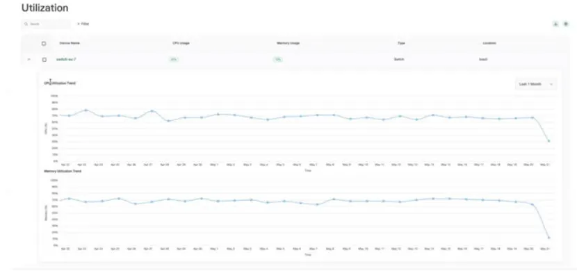
The top section displays a tabular summary of devices with key metrics:
Column name | Description |
|---|---|
Device Name | Name of the network device |
CPU Usage | Current CPU utilization percentage (displayed with status indicators) |
Memory Usage | Current memory utilization percentage (displayed with status indicators) |
Type | Device category (e.g., Switch) |
Location | Physical or logical device location (e.g., Brazil) |
Utilization trend charts
Two trend graphs are displayed as follows:
1. Network CPU Utilization Trend
2. Network Memory Utilization Trend