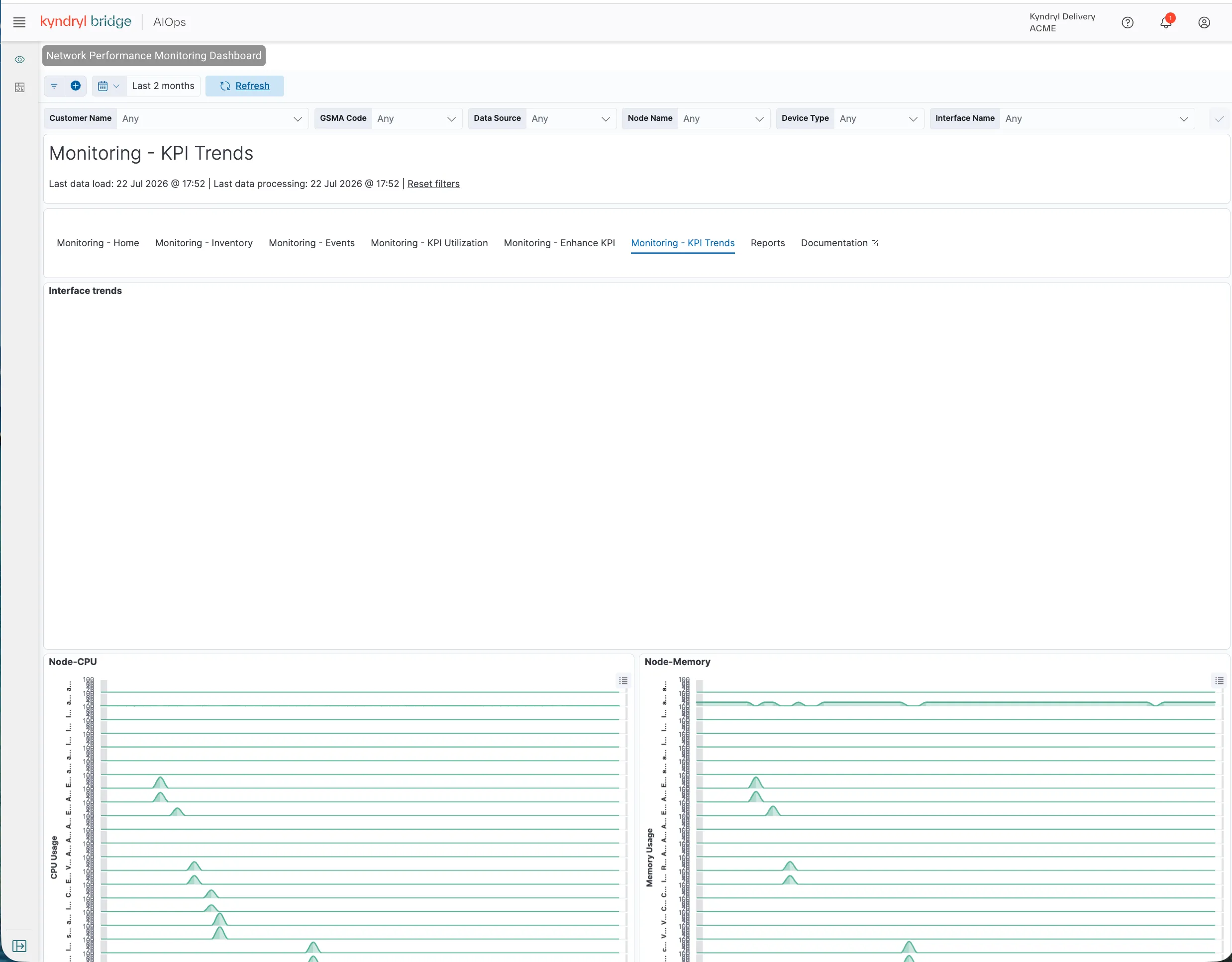
Monitoring - KPI Trends
The Monitoring - KPI Trends page presents data visualizations that enable an understanding of current KPI such as number of nodes that have failed over a given period. In addition to data visualizations, the page provides a quick filter to enable the narrowing of data without complex queries. Parameters include the following:
- Customer Name: Devices owned by specific customers.
- GSMA Code: Devices associated with a specific GSMA code.
- Data Source: Any supported data source used to track network devices and operating systems.
- Node Name: Specify a node by name.
- Interface Name: Specify a supported interface.
- Event Type: Specify an event type.
Each parameter allows a boolean Include/Exclude option.
- Click Include to limit the result to include your selection.
- Click Exclude to limit the result to exclude your selection.
Hover over the right upper corner to present the display options icon (elipsis). The following display options for the visualization are supported:
- Settings: Apply a custom time range or other options.
- Inspect: Download a report.
- Maximize: Enlarge the visualization to see more information. The control toggles to Minimize.
Data visualizations
The data visualization parameters include the following:
Visualization | Plot Type | Description | Hover Data Metrics |
|---|---|---|---|
Interface Trends | Scatter Plot | Displays average interface utilization during the selected time range in daily increments. | • Timestamp • Outbound or inbound percent utilization • Interface traffic caption |
Node-CPU | Scatter Plot | Displays average daily CPU usage for each node during the selected time range. | • Timestamp • CPU usage • Node name |
Node-Memory | Scatter Plot | Displays average daily memory usage for each node during the selected time range. | • Timestamp • Memory usage • Node name |
Refer to the following image for more details on KPI Trends